Circe
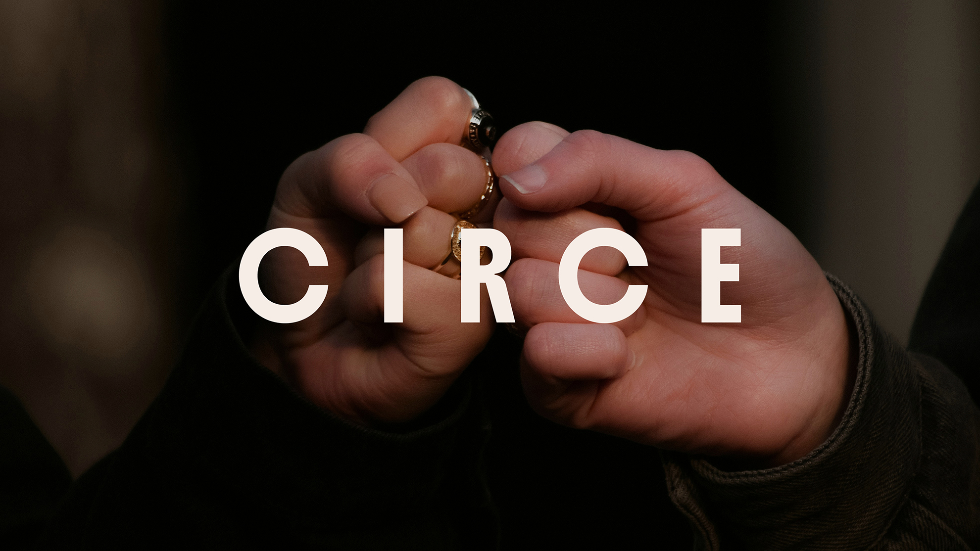
Circe is a perfectly timed intervention, for the slightly broken world of mental health care. We helped this ambitious new therapy platform create a brand that challenges perceptions of group therapy, with a fresh visual identity, a distinctive tone of voice, and a website designed to make people feel good about taking the first step.
Circe
Brand identity, logo, brand guides, website design and Figma asset library
Whilst therapy can be life-changing, for many it remains out of reach, either financially or temporally - thanks to spiralling waiting lists for one-to-one care.
Enter group therapy with intelligent AI matching. It's scalable, affordable, and has the potential to make therapy accessible to many more people. But group therapy is also deeply misunderstood and mired with misassociations. Cold, impersonal, uncomfortable plastic chairs…
Working with Circe to develop their brand and voice, we’re about to change all that.
A delicate balance needed to be struck between trustworthy, like a doctor, but light and homey. In their own words, Circe wanted a brand world where members feel seen, held, understood and able to take life into their own hands.
Mental health brands often fall into two camps: dark and gloomy, or overly clinical and medical. Circe needed to look and feel anything but.
Yet creating a bright, distinctive brand for a therapy provider comes with its own challenges. Accessibility was a fundamental part of the brief, with WCAG AA as our minimum target.
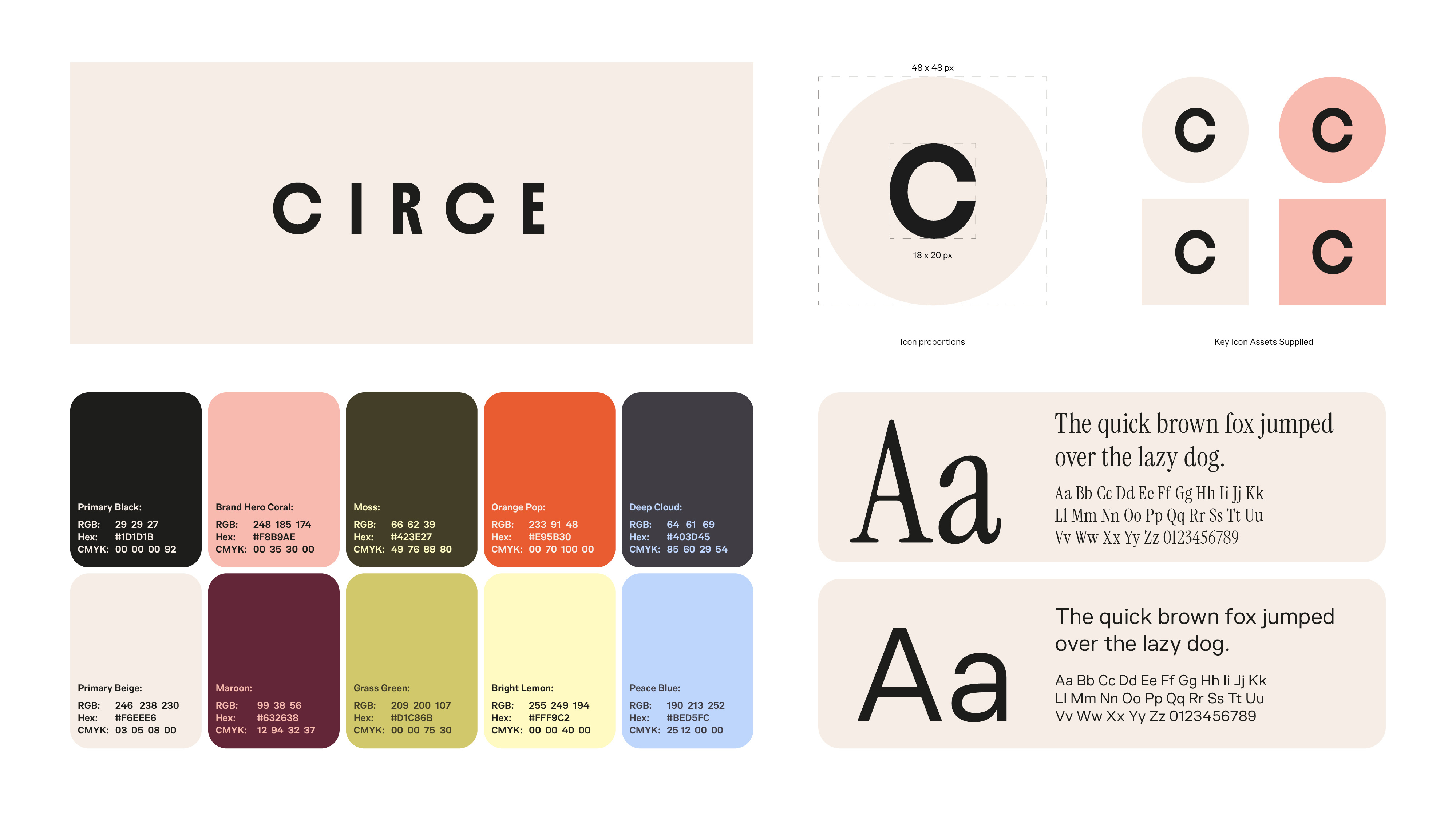
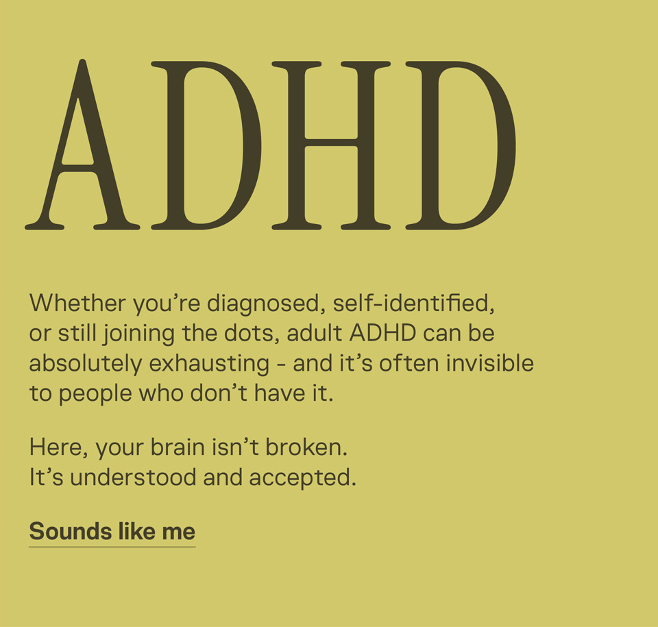
We began by exploring the competitive landscape, identifying the white space for something different. A soft foundation of off-white and beige, with a warmer, gentler alternative to black, helped reduce harsh visual contrast and create a calmer reading environment.
From there, the palette grew around coral, with expressive colours inspired by nature, joy, growth and a little bit of Hygge.
Every colour combination needed careful consideration, particularly where colour and text interact. We tested our designs against WCAG accessibility criteria, achieving AA contrast standards in the intended combinations, and AAA in places, without sacrificing the warmth and personality of the brand.
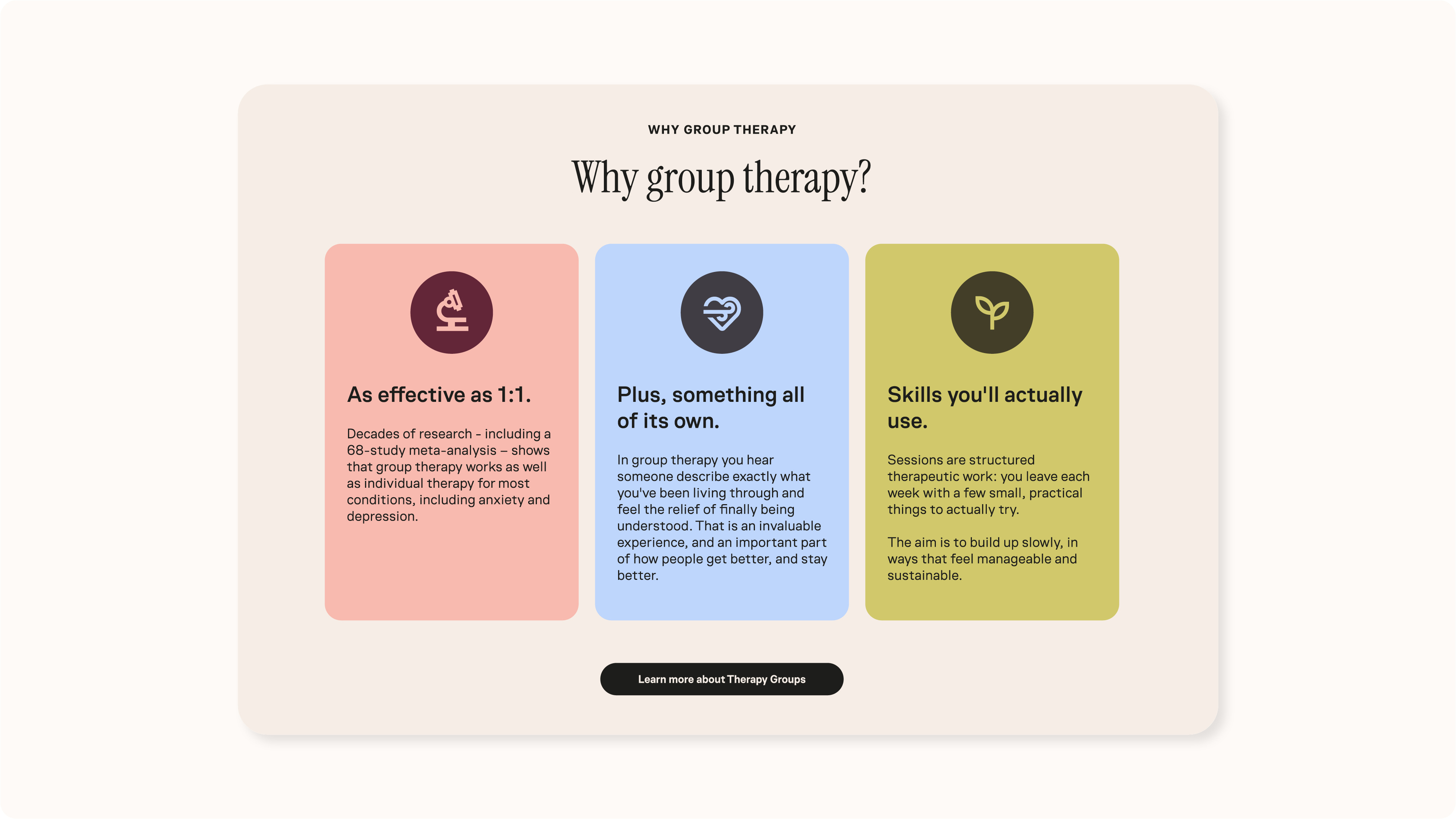

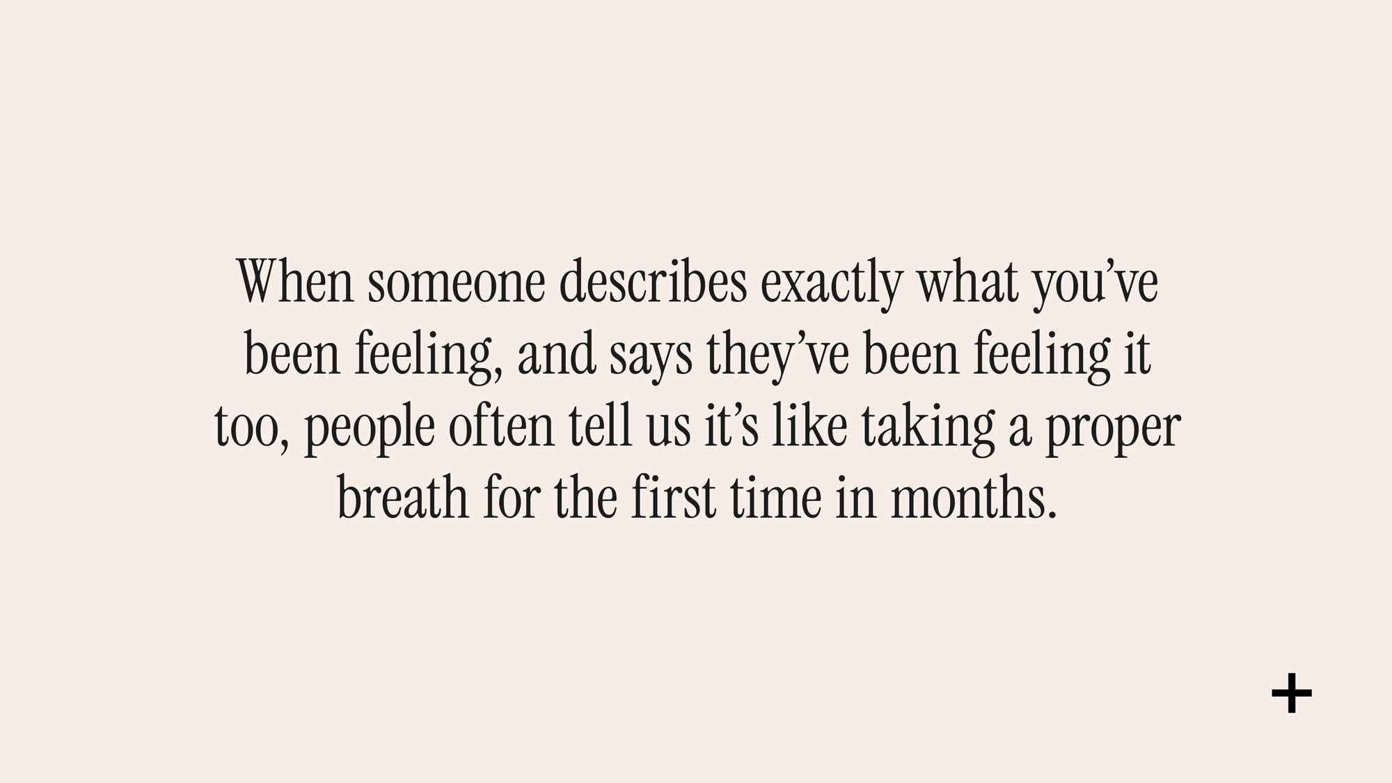



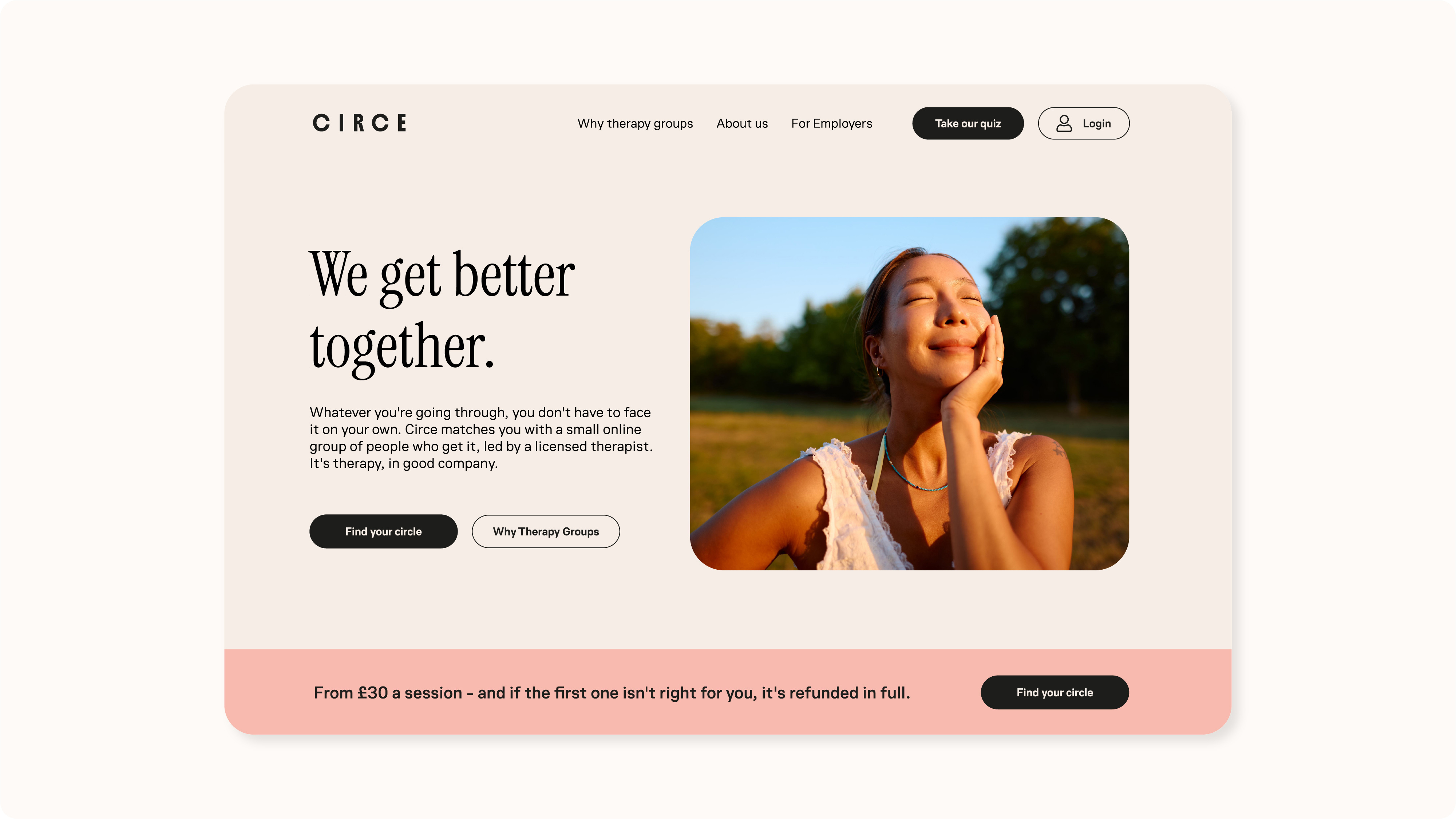
We took the view that many people visiting Circe's website for the first time might already be experiencing anxiety or overwhelm. The last thing they needed was another website shouting at them.
So we deliberately turned down the usual e-commerce tricks. Generous spacing, gentle contrast, clear navigation and a more considered pace created a non-pressured environment, where visitors could feel in control of their own decisions.
Sometimes, giving people room to breathe is the most persuasive thing you can do.
Photography played an equally important role. Working within a tight budget, we curated a library of imagery capturing private, quiet moments. That feeling of breathing out a sigh of relief, or breathing in a sense of clarity and hope.
No sad faces. No staged therapy circles. Just real, uplifting moments of being human.
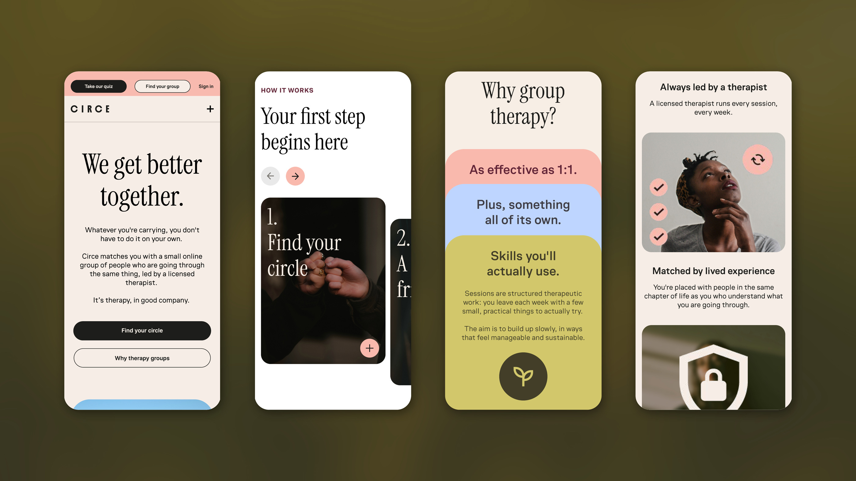

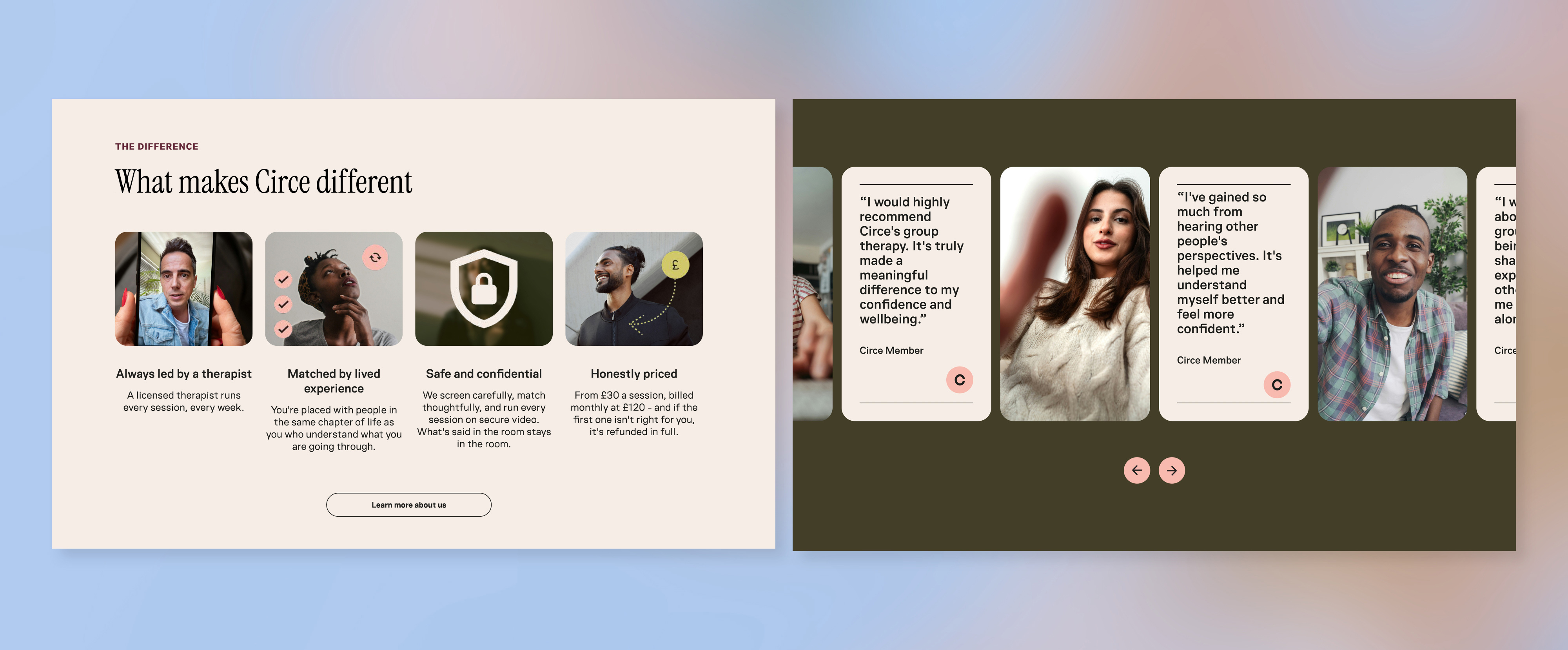
Beyond the logo, visual identity, tone of voice and full website copy, we developed a flexible design system to take Circe beyond launch.
Custom icons gave each therapy group its own visual shorthand, while a complementary open-source icon library, website designs and UI components gave the development team at FatFish Digital the tools to carry the brand consistently through the wider platform.
The result is a warm, welcoming and distinctly different brand that feels trustworthy without being clinical, and playful without losing its purpose.
A new kind of therapy deserves a new kind of brand.


THE NUMBERS
Claudia Radu, Founder